This is Florence and the Machine's cd cover for the album 'Lungs'. This digipak is appropriate for the artist and genre of music. The genre is indie, explaining why the image is unusal, having the lungs shown outside the body. The mise-en-scene also reflects the indie genre in elements such as costume, the top looks vintage and not typical of an artist of today. The background image makes it seem like the artist is caught in some kind of woods, however the pattern looks like wallpaper, crossing the two images over creating the vintage effect. The font used for the artists name is the same font always used, so we recgonise this trademark. The album title is in slightly bigger writing so we can see it over the image. This cover suggests that the music on this album is quite unusual and indie. The back cover is simple, with black and white colours and the track list going from left to right on the bottom half. There is an image of a brain with lines pointing to certain parts labelled with the track numbers. Although this is simple, it creates effect as labelling is something we expect to see on an image of the brain, however we dont expect to see this on an album cover which is unusual.
Lana Del Rey - Born to Die

 This CD cover shows the artist from a mid-shot angle, she is wearing a white blouse suggesting innocence, she shows little expression on her face. It is appropriate for the genre, as it doesn't give too much away about the artist or the music, it leaves you wondering. The location is not very clear however it is outside and there is a bright blue sky and green trees, the artist is stood infront of some kind of building, again the image doesn't give away too much. The font is in capital letters, making it eye-catching and the colours for the album title and artist name contrast each other. The artist looks glamorous in this image and is presented in this way, selling the artist like this. The back cover is again simple, with a red background and white font. The font is again in capital letters, and the track list covers the whole of the back cover. There is nothing signifcant on this album cover to suggest the genre or the iconography of the artist.
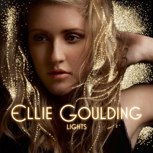
 Ellie Goulding - Lights


Ellie Goulding's digipak for her album lights has a close up image of her face. There are small gold lights surrounding her and flowing through her hair. This is appropriate for the alternative genre and is something you would typically expect of a alternative artist. The image also reflects the name of the album which is written in small illuminous writing underneath the artist's name. There is little mise-en-scene to be seen on this image cover, the lighting being the main effect. The black background contrasts with the gold lights making them stand out even more so. The image and styling connects with the general public, as the artist looks like a usual girl. The back cover is again black, making the illuminious font of the track list stand out. This is a simple cover, simply showing the track list.
Kate Nash - Made of Bricks


This album cover shows the artist walking up to a house, looking back at the camera. The house is quite grand, with unusal things in the garden such as hedges cut into horse silhouttes. This mise-en scene suggests the artist is quite wealthy and that her music may be of the indie/pop genre. The costume is a red dress with black heels, red suggesting danger may lie ahead or love/lust. The font is quite unusual, looking like untidy writing, stating the album name in small writing, with the artists name in larger writing underneath. The white writing contrasts with the blue background, making it stand out. The styling of the artist isnt unusual for a pop artist, however it is the mise-en-scene that suggests the indie genre. A childlike theme runs through this cd cover including the theme, the innocent pose and the large flowers and colourful house. It is appropraite for this genre as it is something you would expect from this type of artist. The back cover is simple, with the blue background used again, as well as the childlike, white font, the tracklist covering the whole cover .
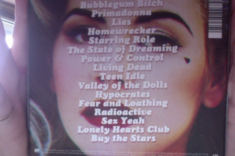
Marina and the Diamonds - Electra Heart


This is an album cover from our chosen artist Marina and the Diamonds. It is appropriate in representing the genre and type of artist that she is. The mise-en-scene is kept simple, the make-up and hair being the emphasis in this photograph of the artist. She has gone for the 60's look here, with rollers in her hair and bright red lipstick. She has the signiture black love heart on the side of her face, making the audience able to identify her. The whole image has been blurred slightly creating the effect that she is a vintage artist. The text is illuminous and in a standard bubble writing font, it blends well with the background and image all together. The back cover of this cd again shows an image of the artist, but this time a close up shot. Her hair and make-up is kept the same from the front image, nothing has changed to suggest anything else about the artist. In both images, she is not smiling and shows little expression. The track list is again in the illumionous font, overlapping the image and covering the whole side.
After researching previous cd covers, we would like our cd cover to have an image of the artist being the main focus. The colours will be kept neutral/pastel as this fits in with our genre of music. We would like the artist to be being vintage clothing to allow the audience to see the style of the artist. The artist will have glitter under her eyes and there will be an american flag on the back cover to represent the artist and where she is from. Our font will be kept simple, but with a bit of an edge, with the title of the song at the bottom and the name of the artist at the top in slightly larger font.


No comments:
Post a Comment